Identity: "The fact of being who or what a person or thing is"
What makes you, YOU
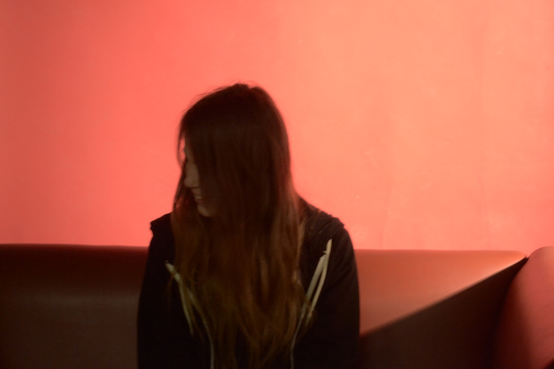
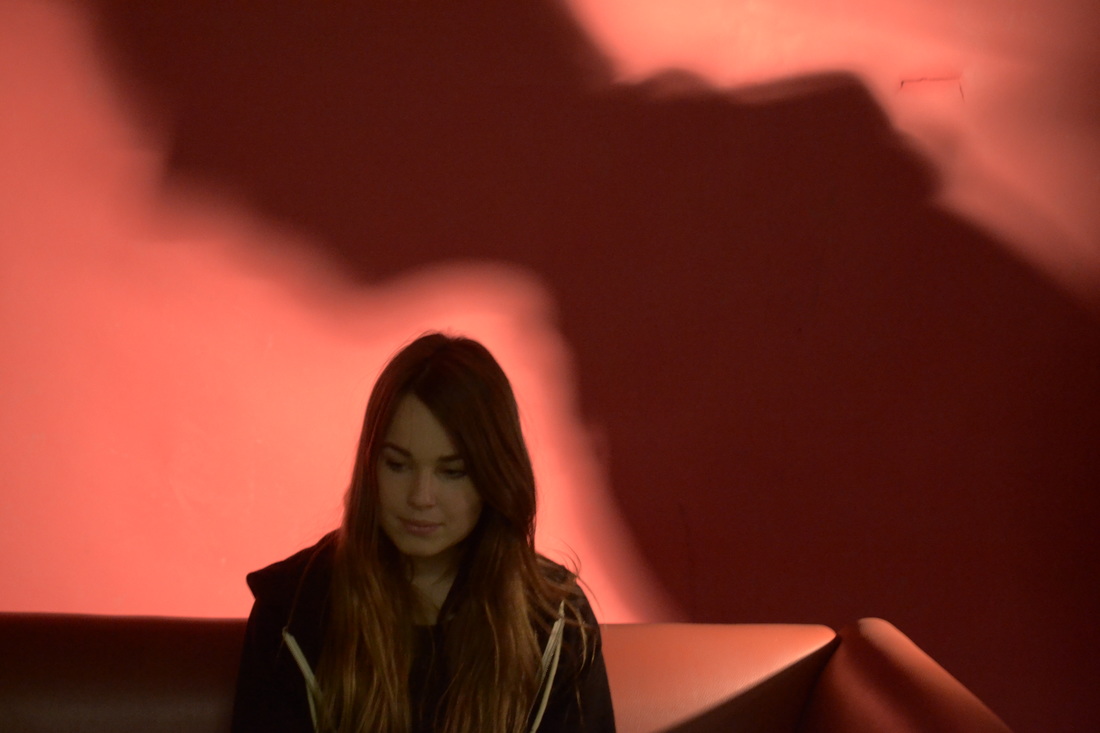
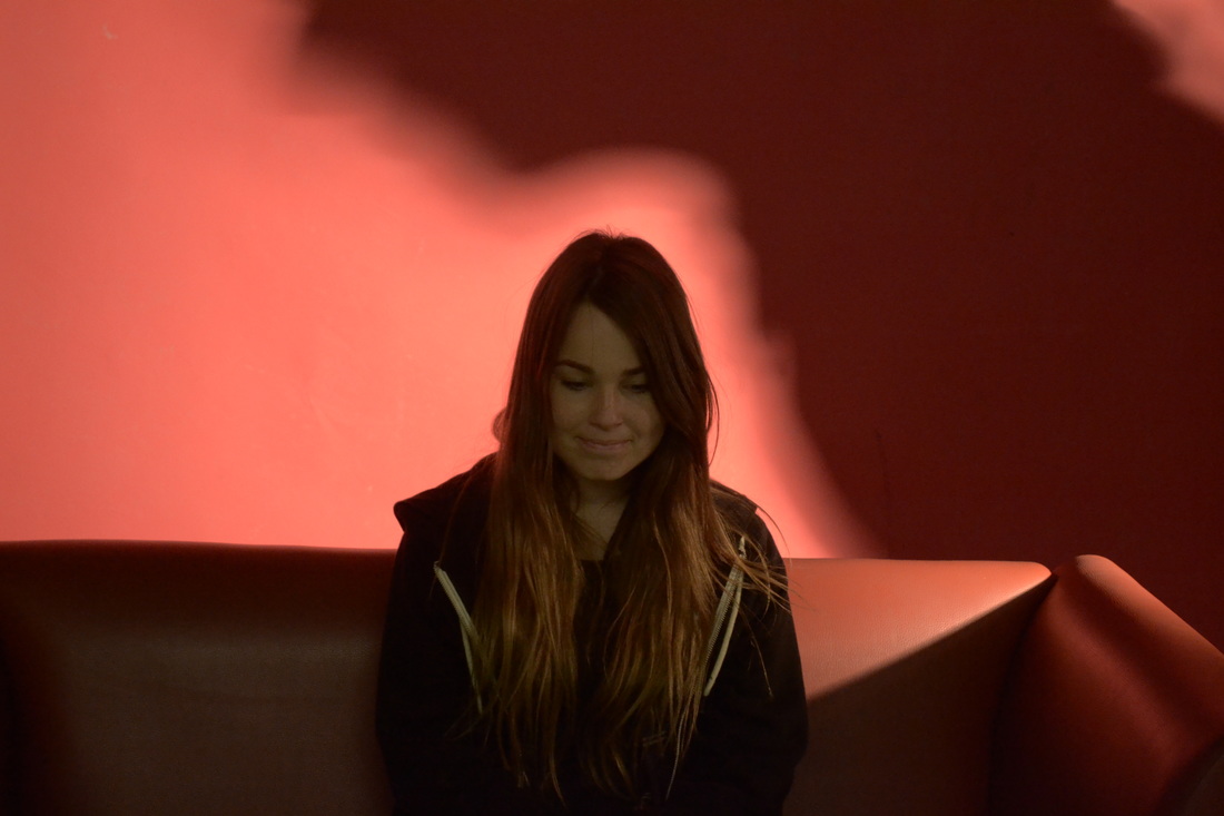
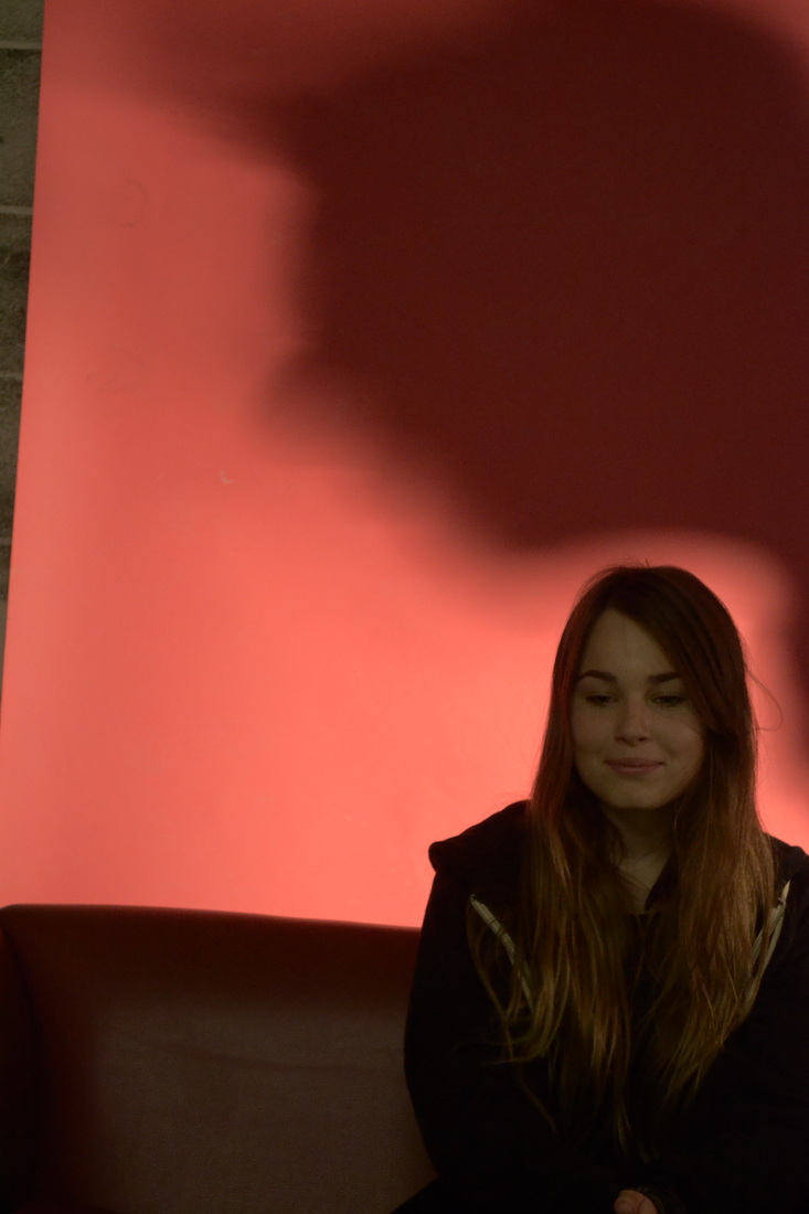
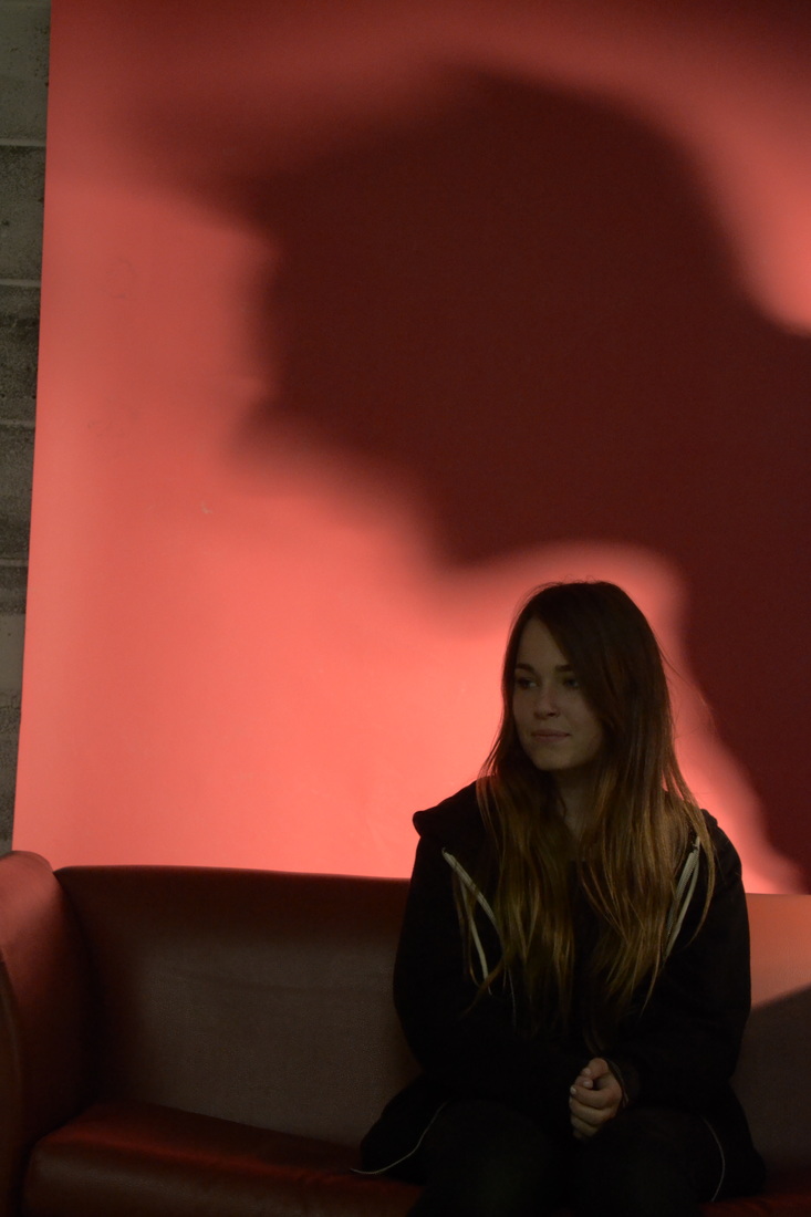
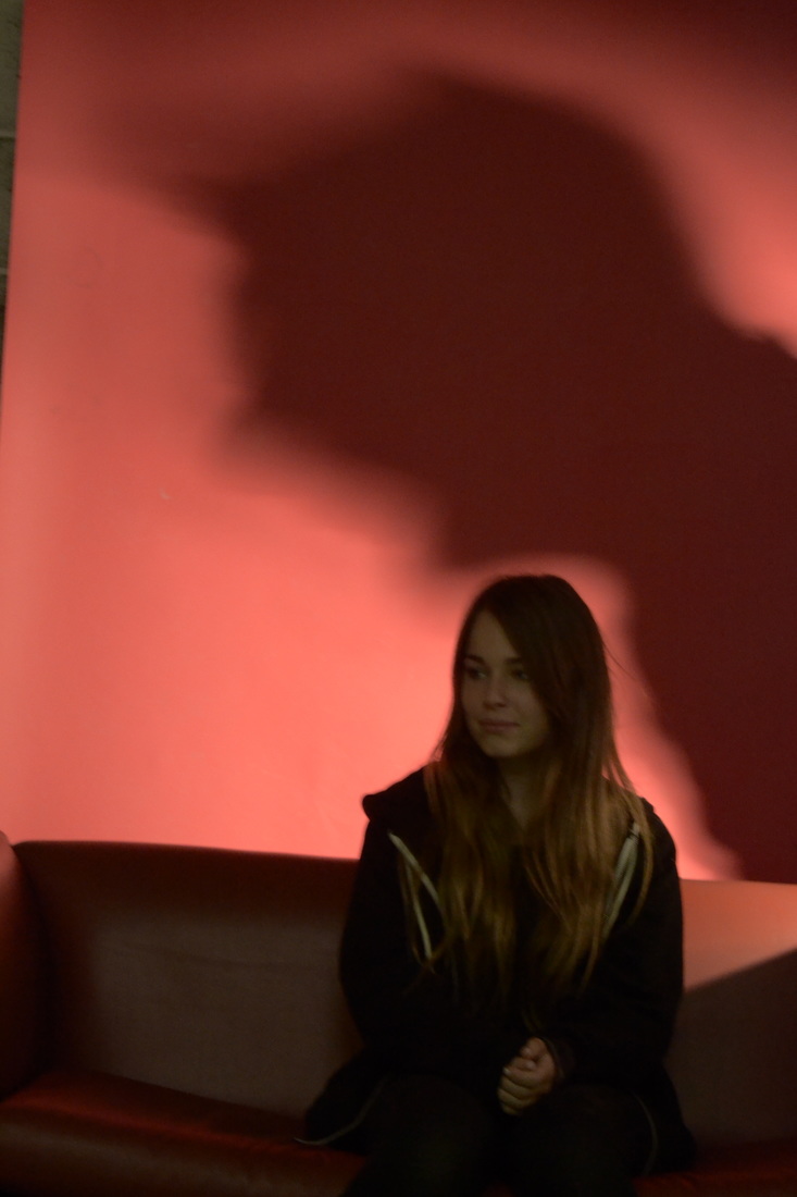
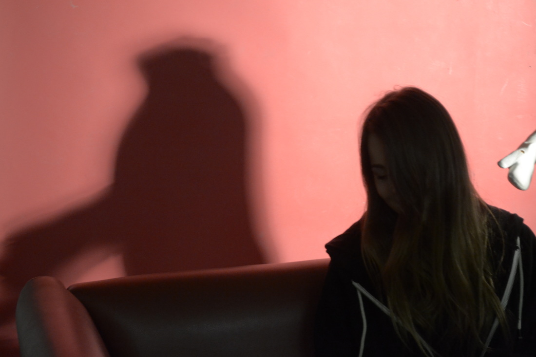
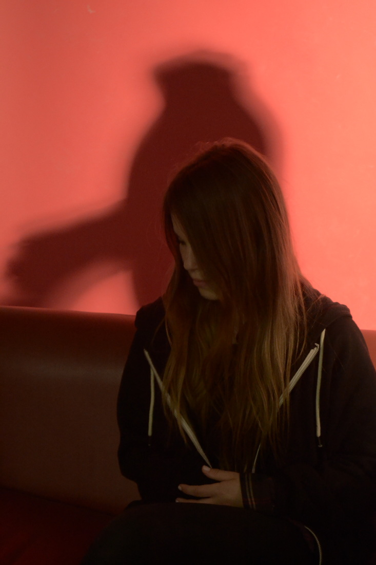
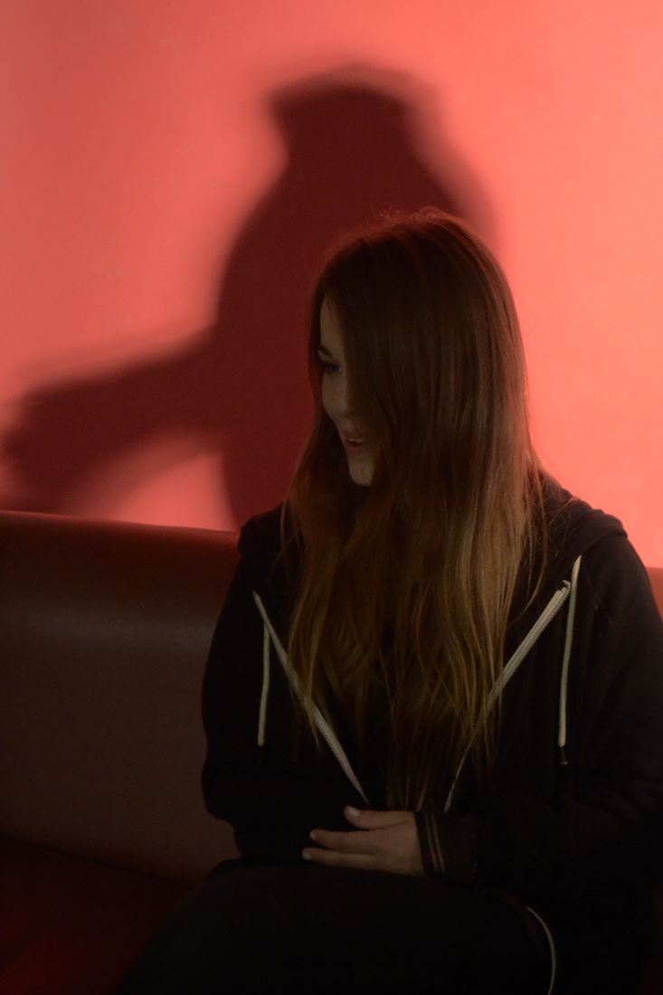
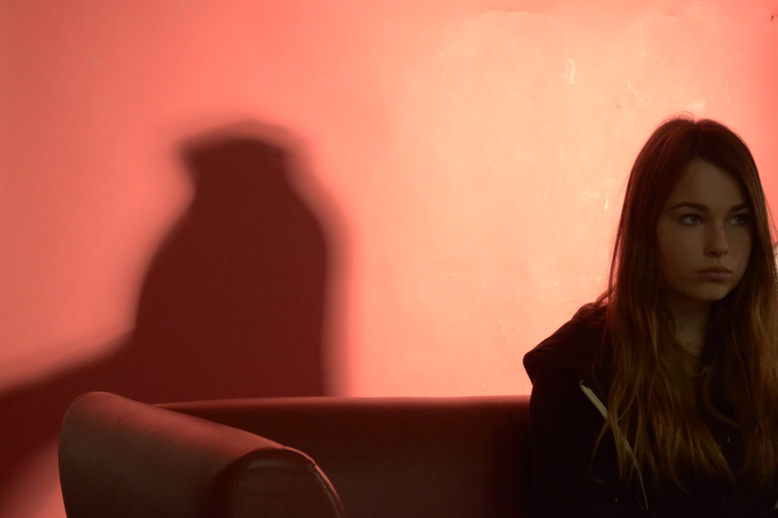
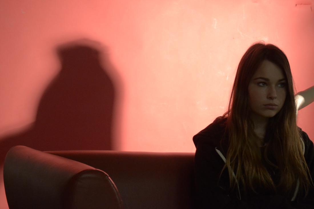
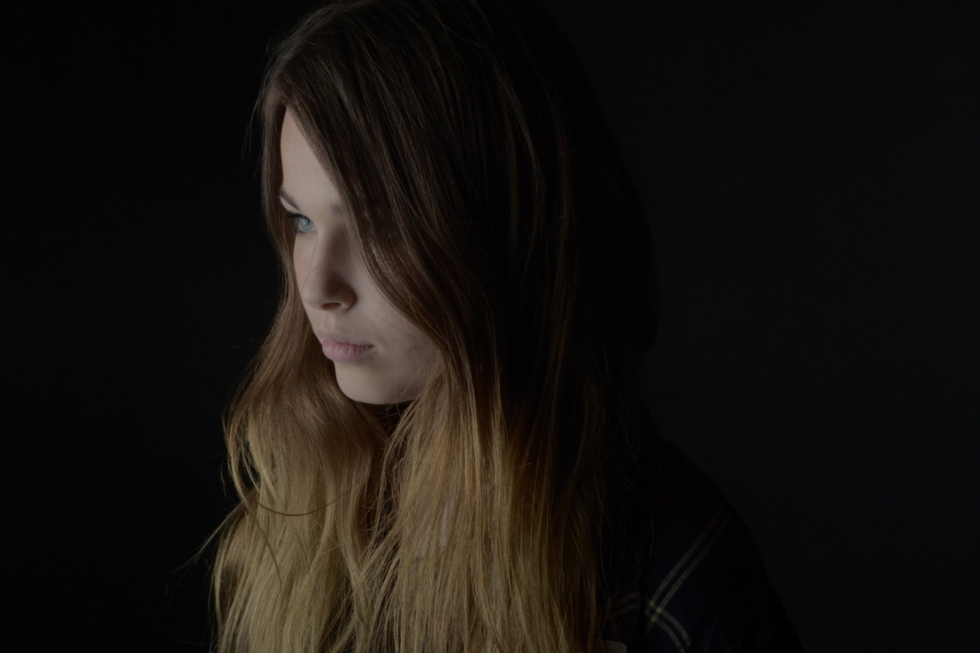
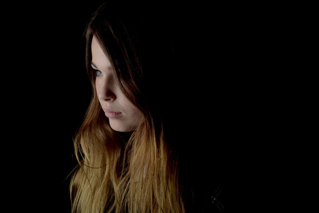
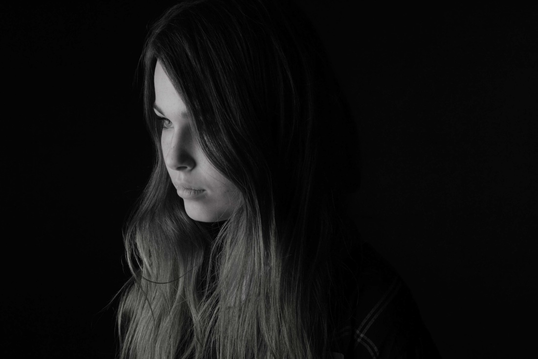
Creating mood with lighting:


Rankin
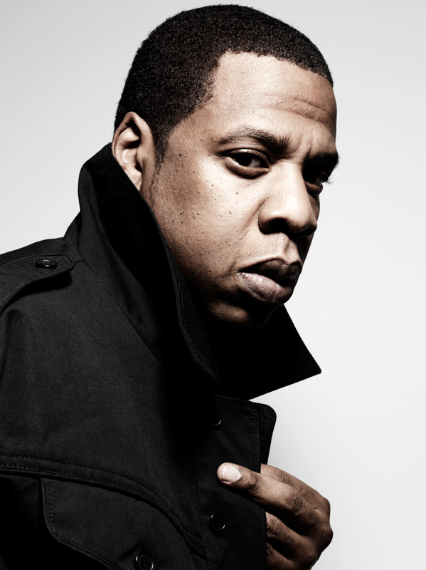
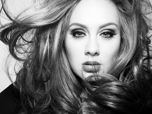
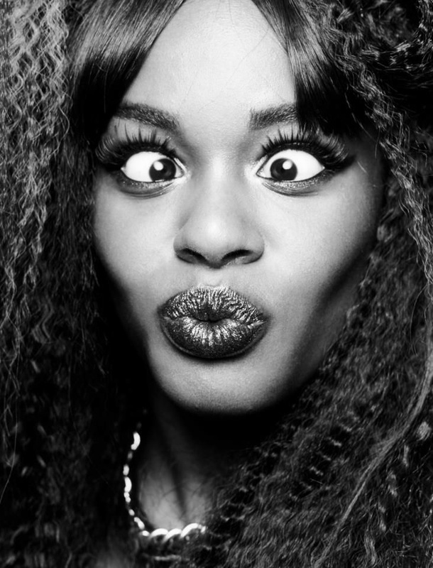
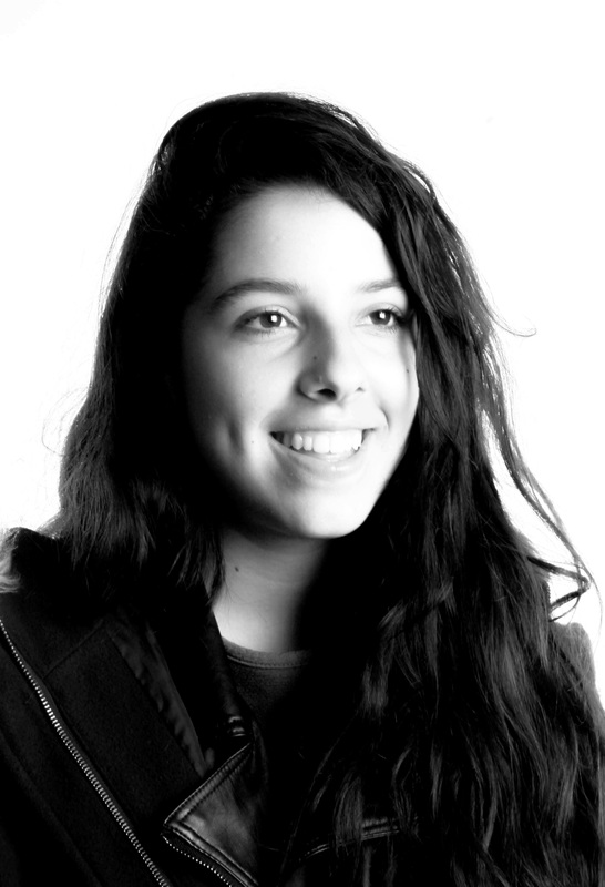
John Rankin is a world famous professional photographer. His focuses are mainly on faces and "identity", he has photographed many famous celebrities including Famous Rapper Jay-Z. He uses fashion, jewellery, composition, lighting and posture to enhance his pictures.
In 2011, Rankin Film Productions was born. He developed a taste for film, and started directing music videos, commercials, and short films with co-director Chris Cottam between 2002 and 2009, including their debut feature film, The Lives of Saints.
Personally I think his photos are interesting and are cleverly put together. The fact that he focuses on faces can tell you a lot about the person being photographed, facial features are dominant in the photos, you can tell personality, and emotions from the face, this is what makes it so unique.
My response to rankin
|
|
|

|
|
|
|
|
|
|
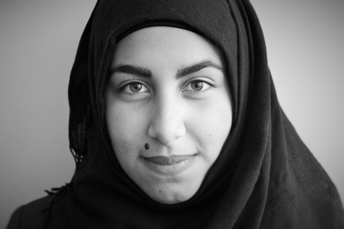
Rankin and the theme of identity
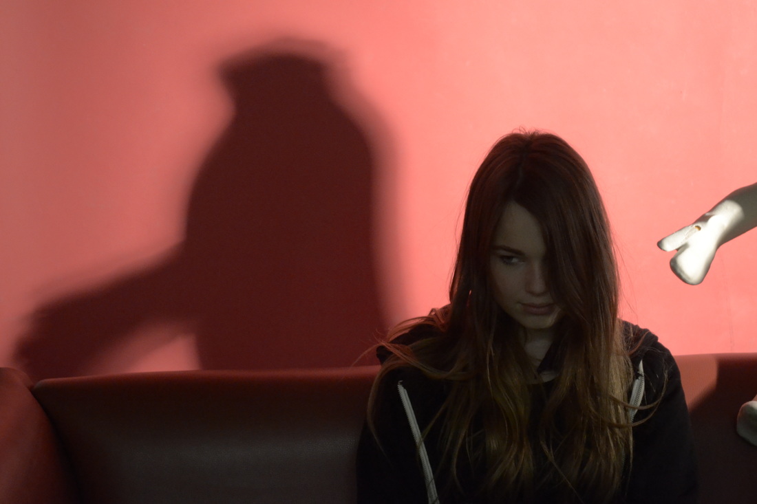
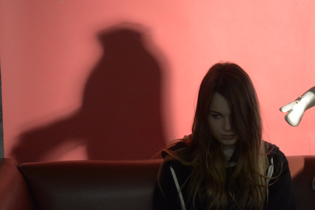
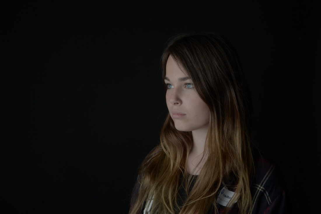
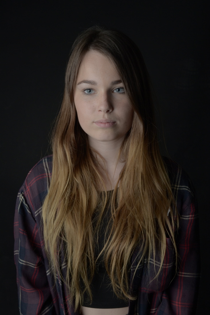
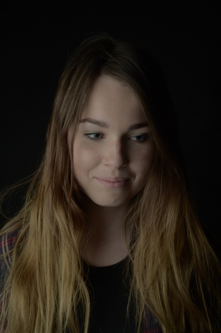
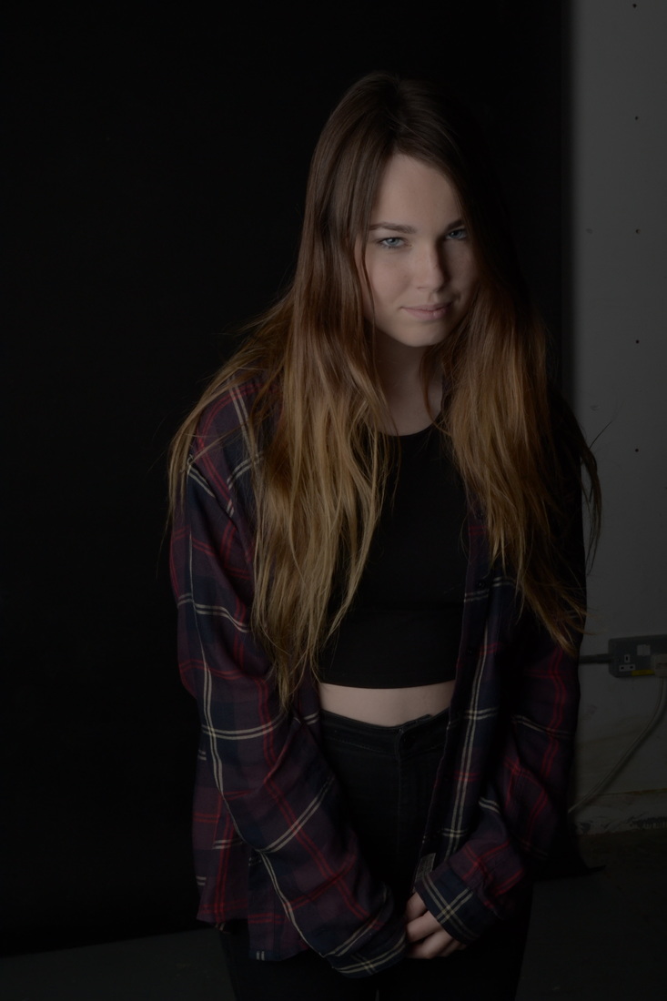
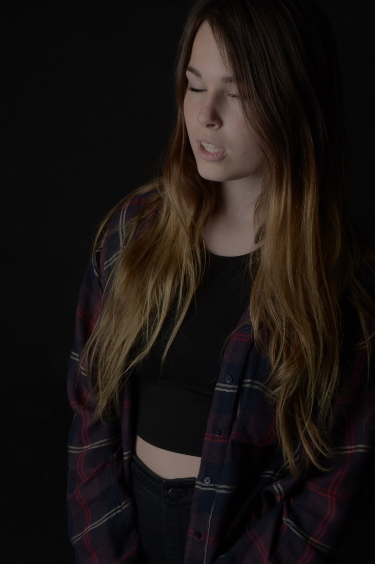
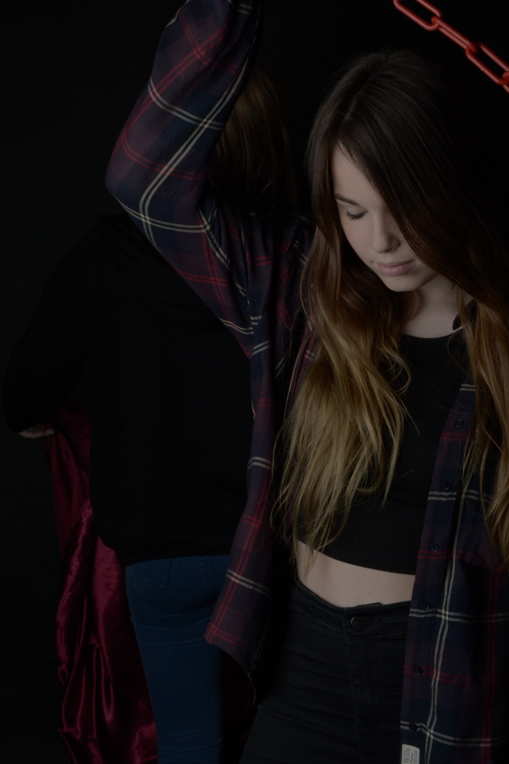
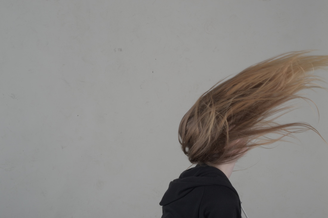
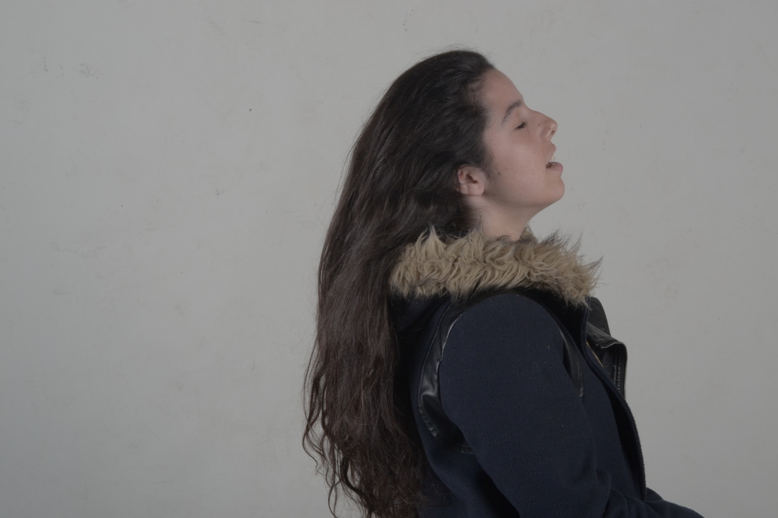
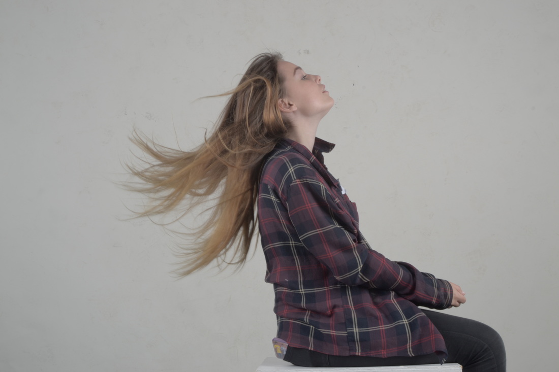
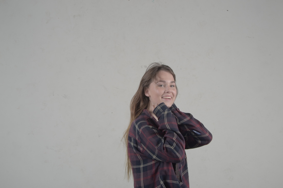
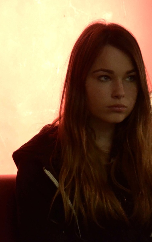
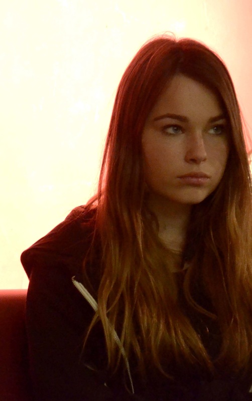
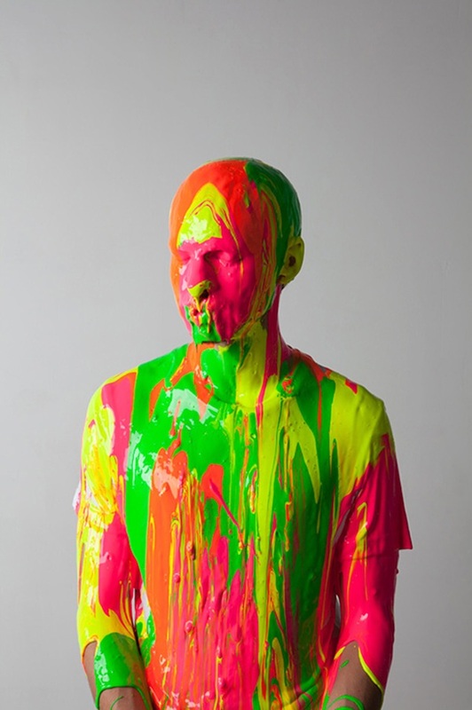
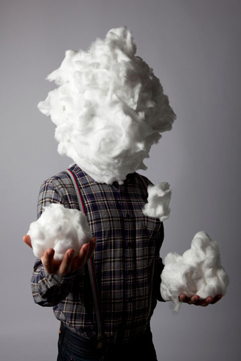
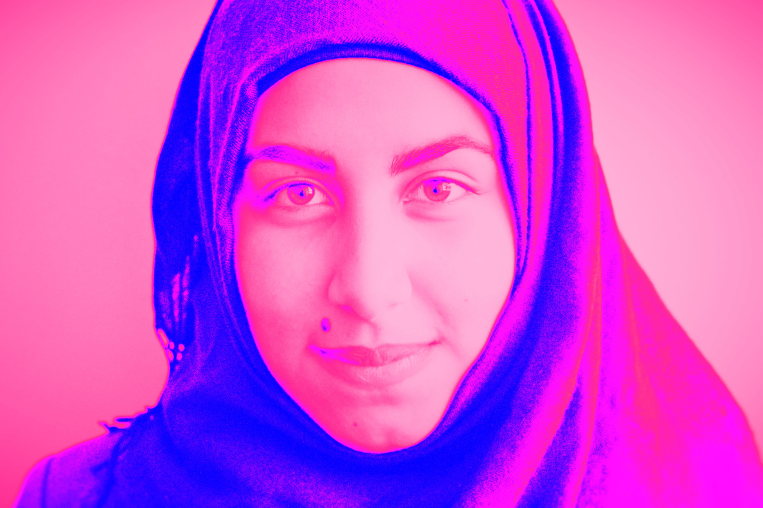
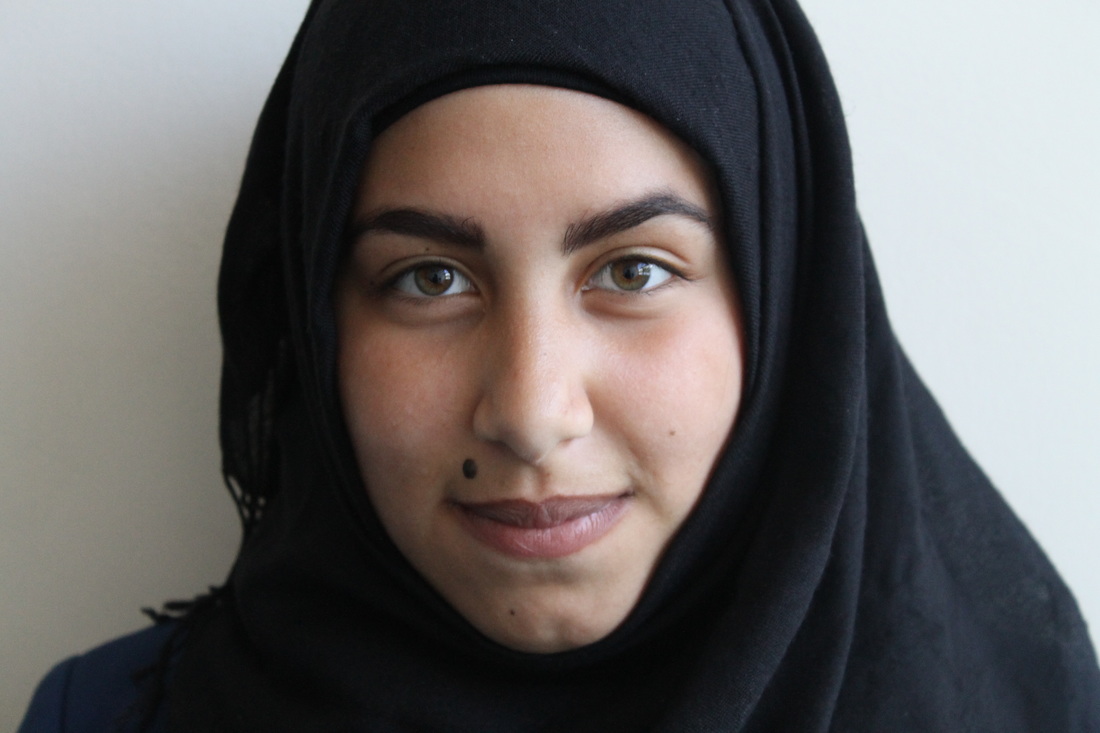
One of the main themes that rankin photographed in these photos was the theme of identity, this could mean covering the whole face or have certain features showing, I am extremely fascinated by these photos because they are enticing and aesthetically pleasing, they are stunning photos in a clear and crisp quality, I think that it is important to have a good quality when taking photographing a face or a person because it can look poor and unprofessional.
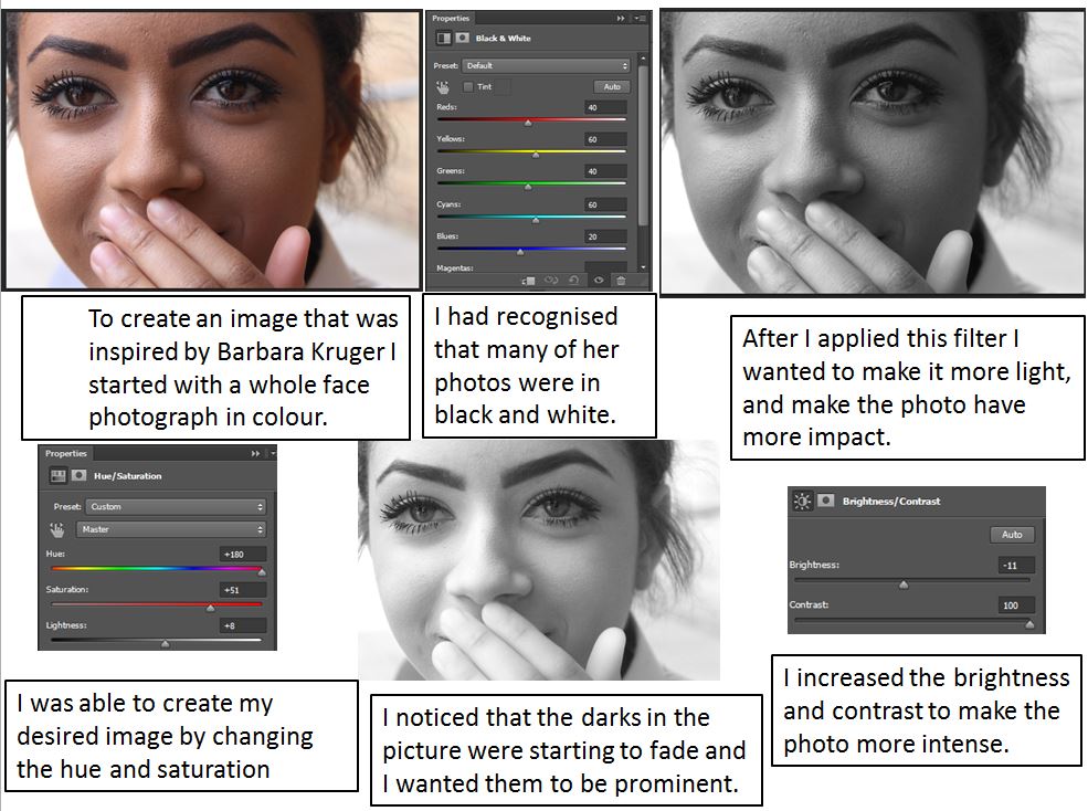
I recreated his style with my own flair, these are the edited and non-edited photos. In these is turned down the contrast to create a sleek look and I turned up/down the brightness till I felt the photo made impact or was a level of intensity.
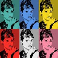
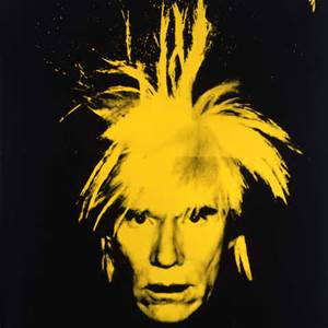
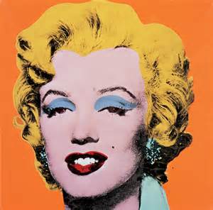
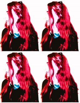
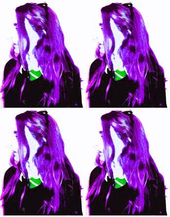
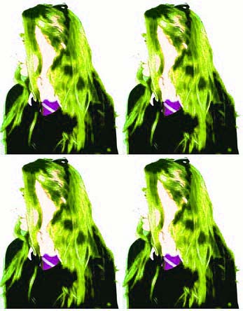
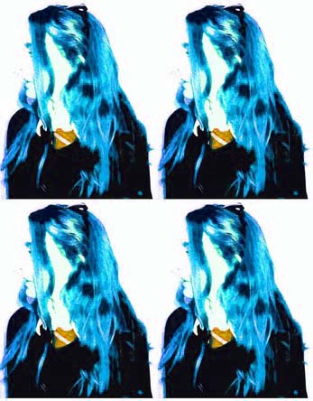
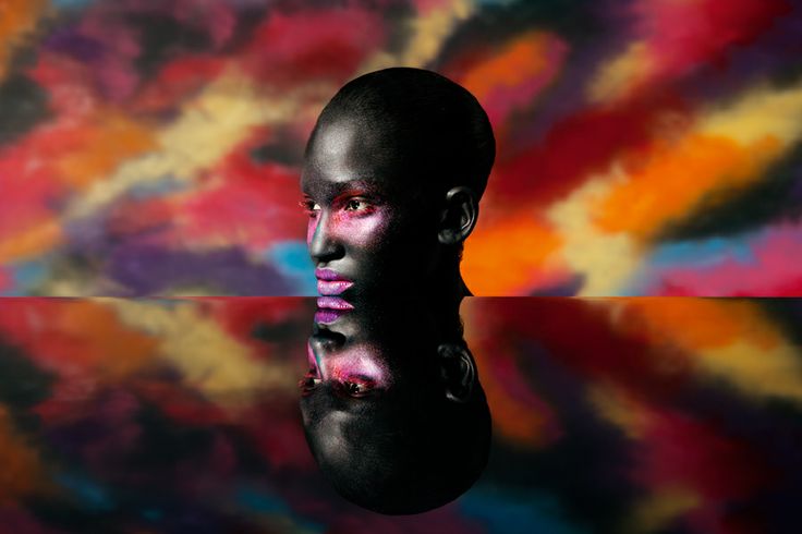
Andy Warhol & The Pop art movement
Andy Warhol was an American artist in the 1960-80s who was a leading figure in the Visual art movement, widely known as pop art. His pieced explored the nature of artistic expression, celebrity culture and advertisement that flourished in the 1960's. Warhol became renowned for his bold colours and high contrast pictures, his style contains these bold colours everywhere, they were eye catching and took the viewers attention straight away, they were mesmerising and outstanding sending a statement to the current artists of that time.
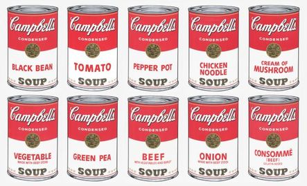
I like this picture because the colour is the first bold thing that stands out in the picture, The theme of this photo is clearly the "Campbells" soup, the attention to detail is outstanding and it looks like a photograph. the crisp lines and contrasting colours make the picture come alive as if they cans are in front of you, but the abstract stacking that make the cans appear that they are floating above each other jumps out and makes the image more intense and interesting.
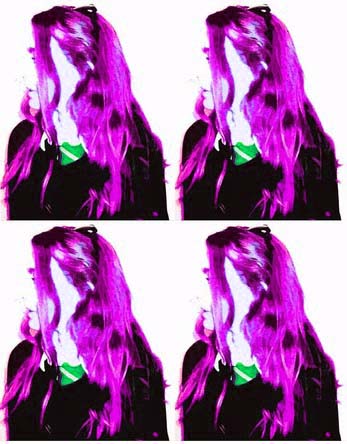
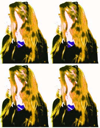
My own impression on the pop art movement.
|
|
|
|
|
|
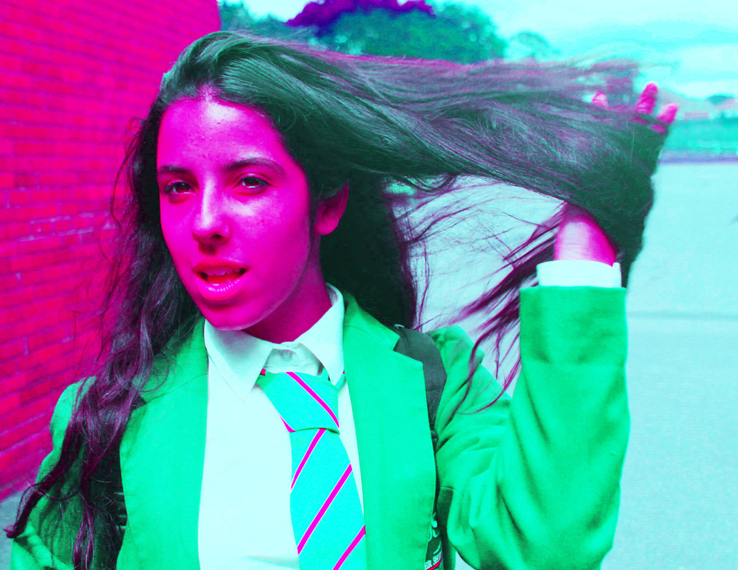
In this photo I took a single shot and edited it in
Photoshop, I added contrast, intense colours and turned up the brightness to add a pale effect to her face and background. I tried to mimic the pop art style but, for the picture to have my own twist on it instead of it looking more posturized I did not use the effect because I wanted the image to look like a picture and not like painting, as the usual pop art form was presented.
Photoshop, I added contrast, intense colours and turned up the brightness to add a pale effect to her face and background. I tried to mimic the pop art style but, for the picture to have my own twist on it instead of it looking more posturized I did not use the effect because I wanted the image to look like a picture and not like painting, as the usual pop art form was presented.
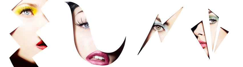
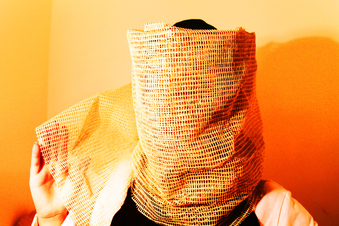
Akatre
Akatre is a Graphic Design and photography studio founded in Paris by Valentin Abad, Julien Dhivert and Sebastien Riveron in 2007. They produce images that are visually appealing and creative. Their photographs and graphics can be geometrical and have an interesting colour combination, getting viewers attention right away. Some of Akatre’s artworks have a mix of futuristic, si-fi and retro aesthetic about them.
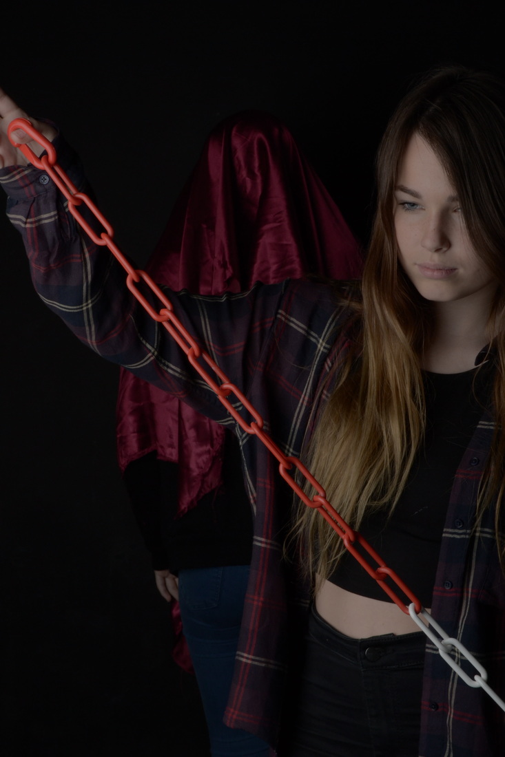
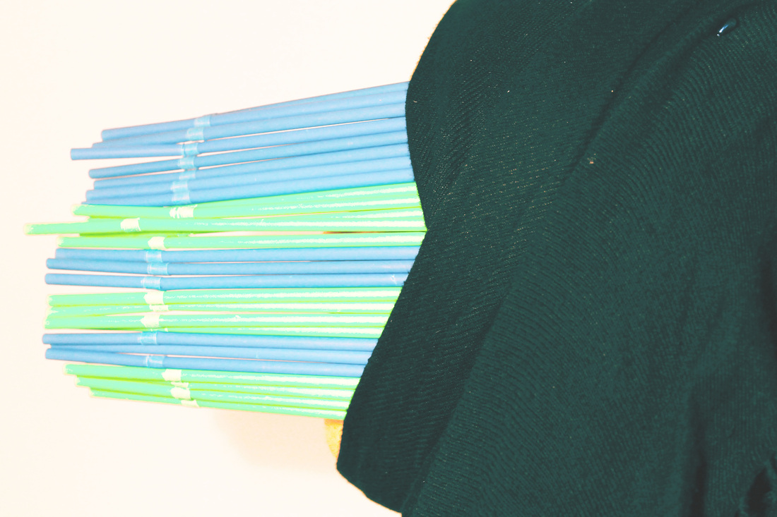
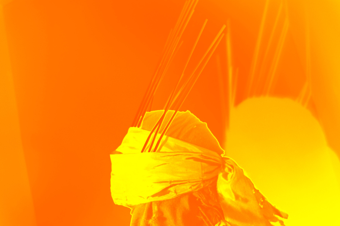
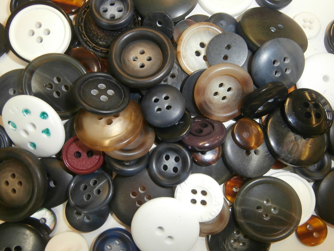
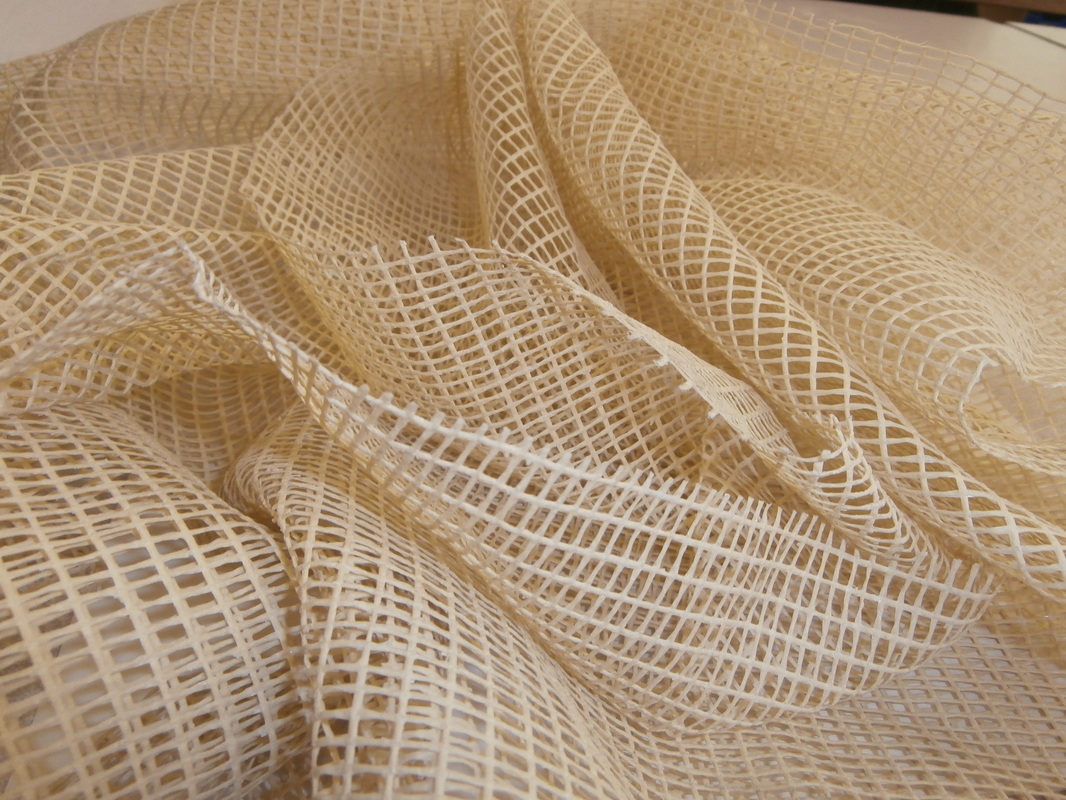
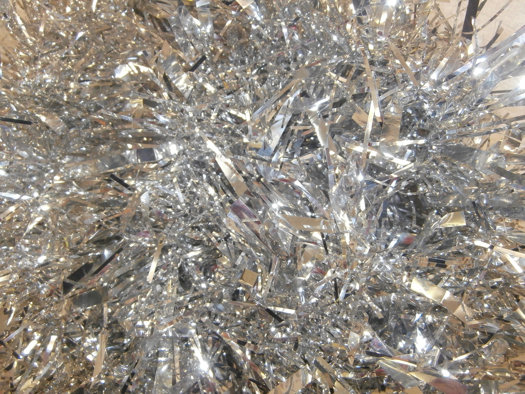
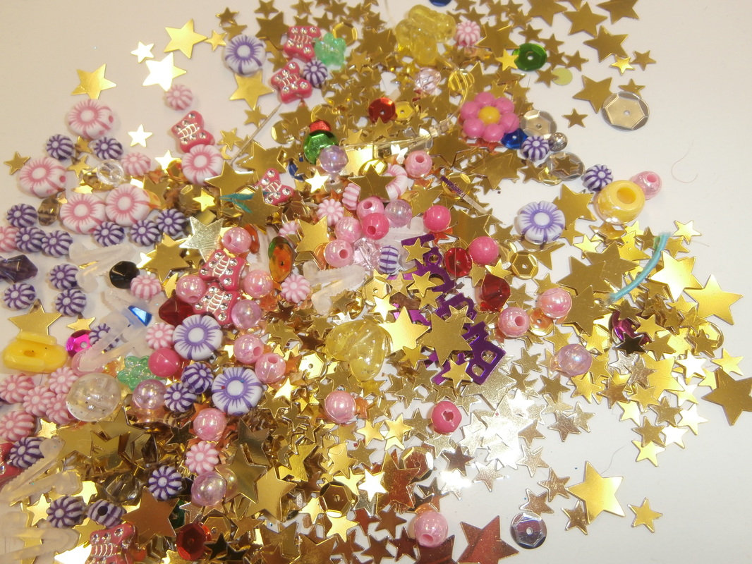
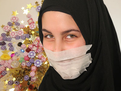
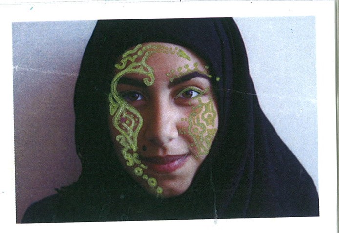
When recreating his style I took into mind lighting, construction and angles of a person, I tried to think outside the box with the materials that I wanted to use, I like the use of having an identity that can show religion or ethnicity but cover the face to emphasize how we identify people not only in our society but all around the world, in different country's and continents.
When recreating his style I took into mind lighting, construction and angles of a person, I tried to think outside the box with the materials that I wanted to use, I like the use of having an identity that can show religion or ethnicity but cover the face to emphasize how we identify people not only in our society but all around the world, in different country's and continents.
____________________________________________________________________________________________________________________________________________________
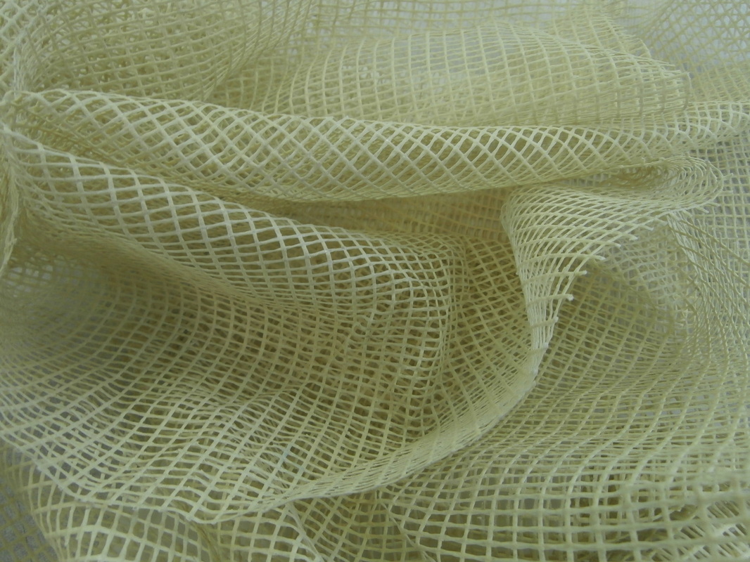
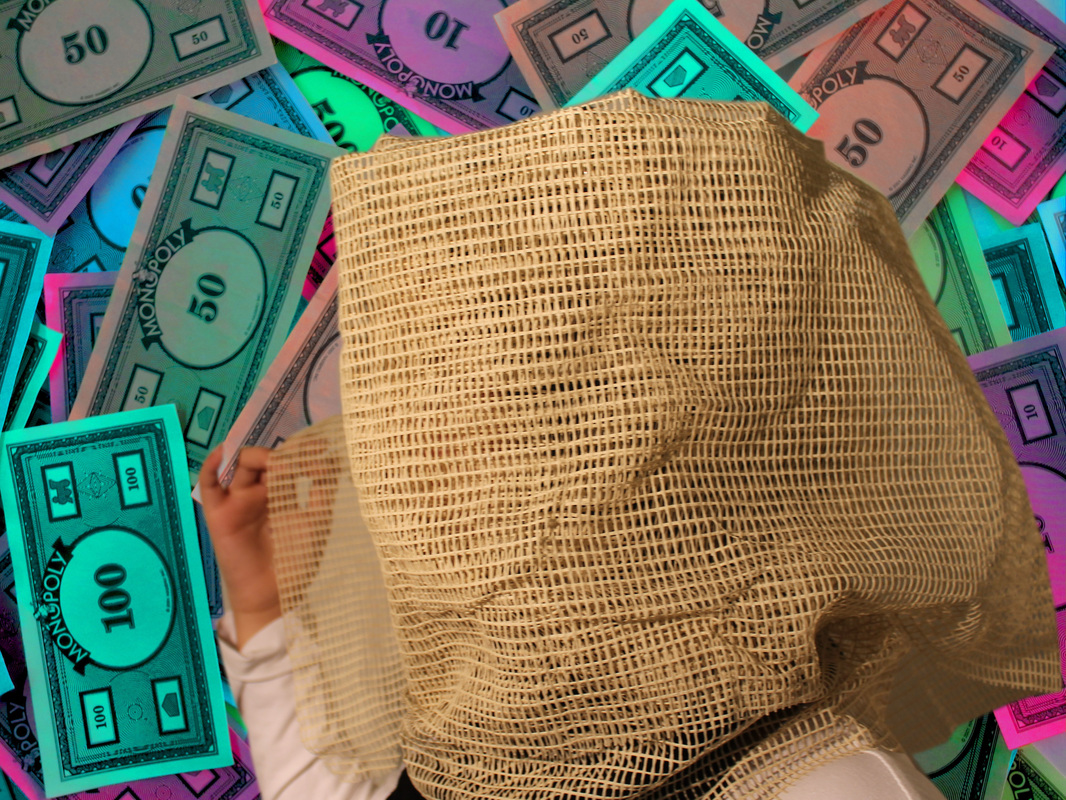
These photos are going to be used as backgrounds for akatre photos.
my edited photos:
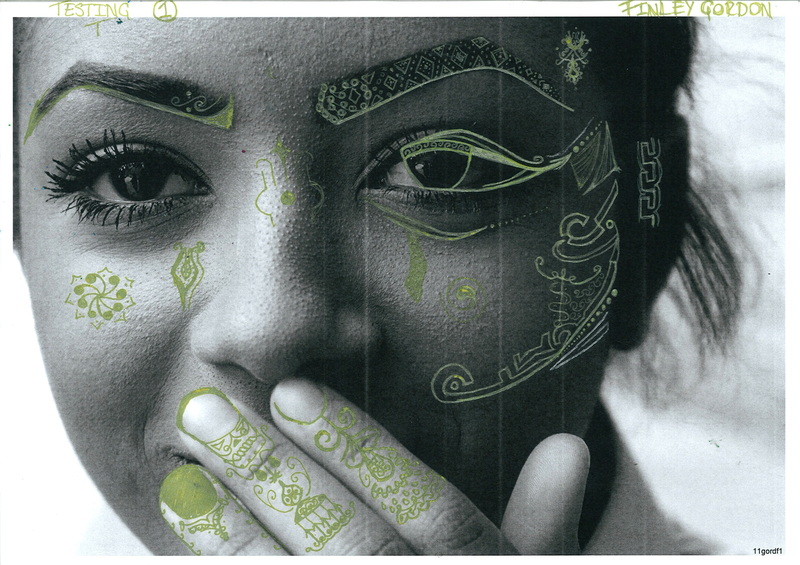
Nina Chakrabati
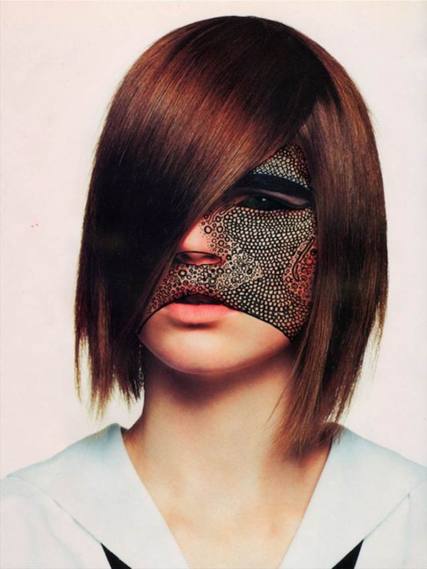
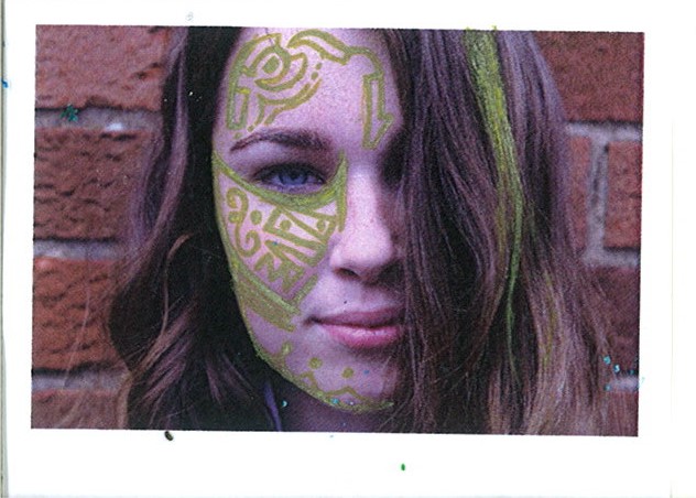
This Nina Chakrabati, was born in India but now lives and works in London, England. Nina likes to use collage in her work she collaborates with other artists when she can, she uses a variety of materials and media in her peices, such as; felt tips, inks, Biro's and pencils, as well as different technology. She hand draws of her models faces and also takes the photos herself, she uses different patterns to show emotions instead of facial expressions.
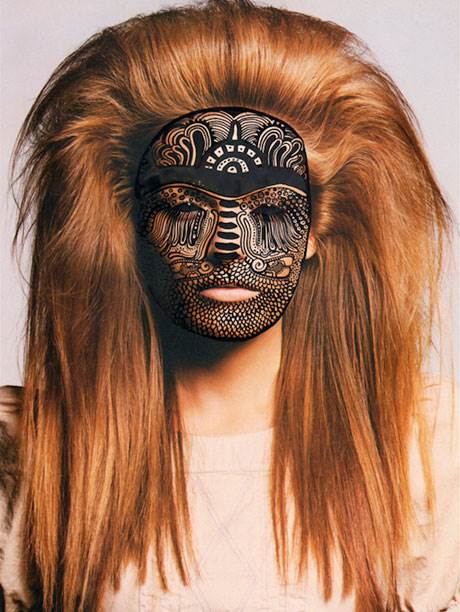
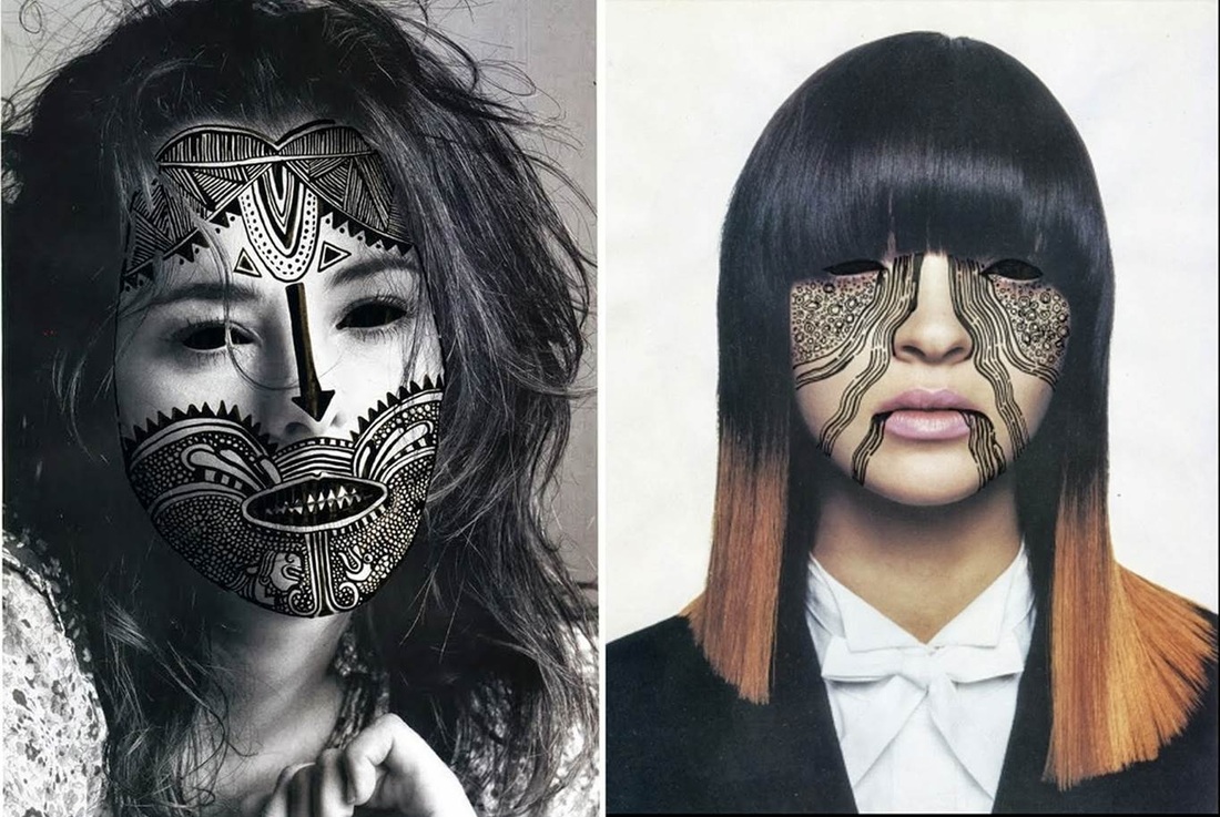
My personal favourite is the 3rd one in from the left, it has intricate and detailed designs that inspires me, its also gives me an impression of attitude and carelessness, it also gives off a vibe of anger because you can see her teeth, its like she is growling at the camera.
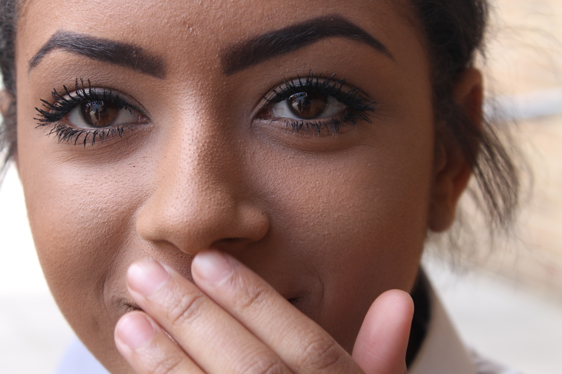
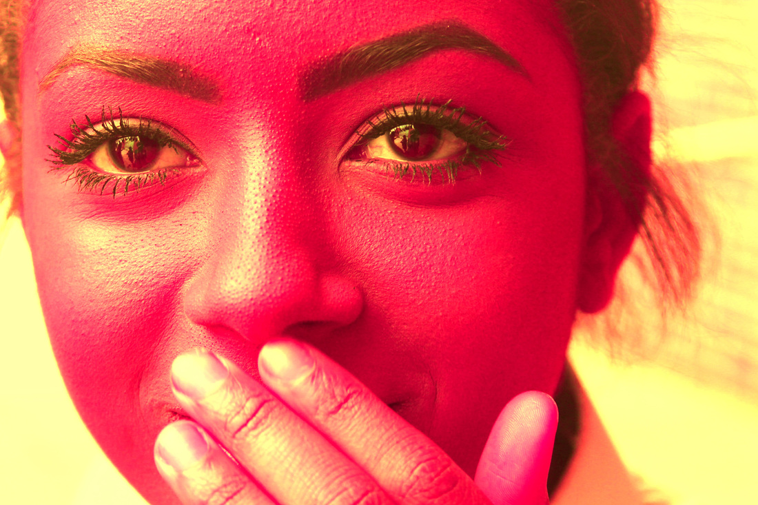
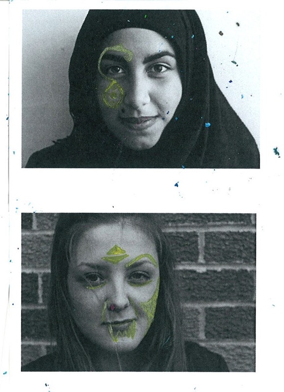
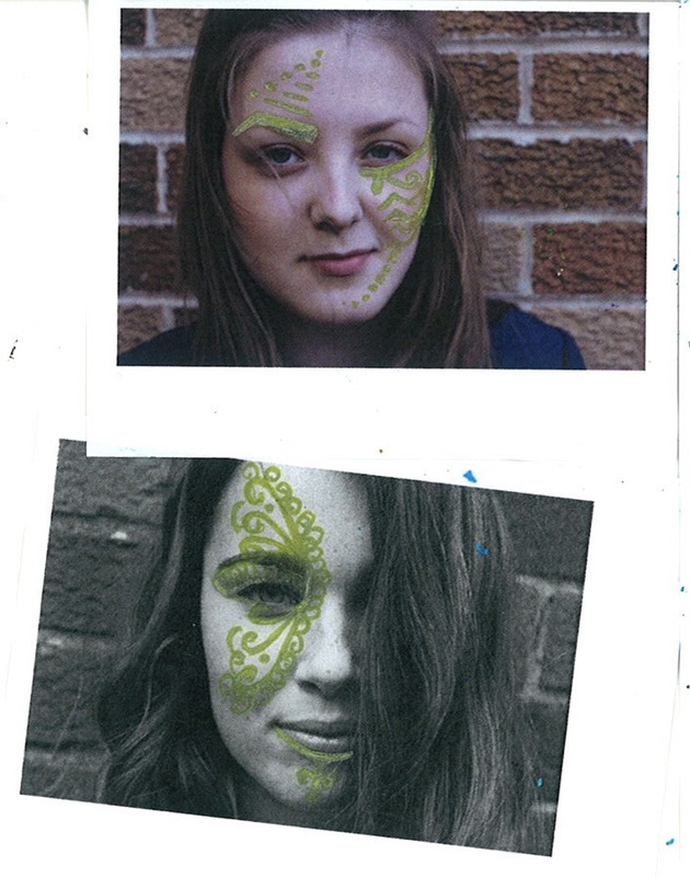
When I studied Nina's photographs its clear that every individual photo has a different emotion, when I drew on my own face I also wanted them to portray different emotions, in the first photo I decided to create a menacing and devilish appearance, I did this by emphasising the eyebrow and putting running blood on, and under the lips. (2) In the other photo I wanted the photo to appear intense and make you feel that I was right in front of you staring at you, I did not need to do anything specific to the photo I mainly relied on the angle of my face, and drawing a black ring around my eye. (1)
-----------------------------------------------------------------------------------------------------------------------------------------------------------------------------------------------
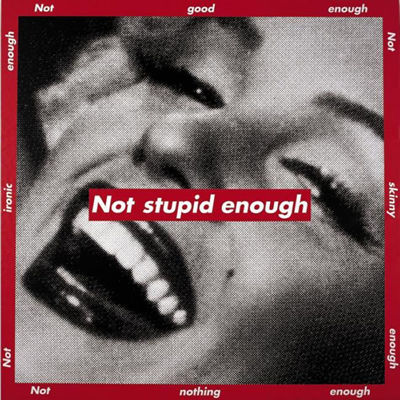
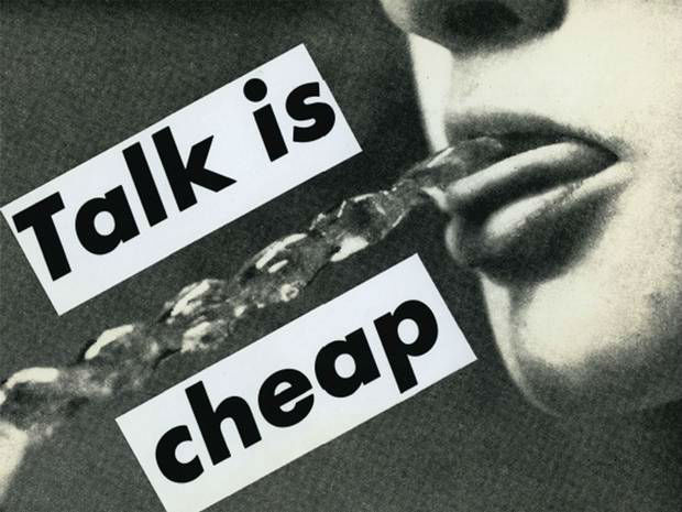
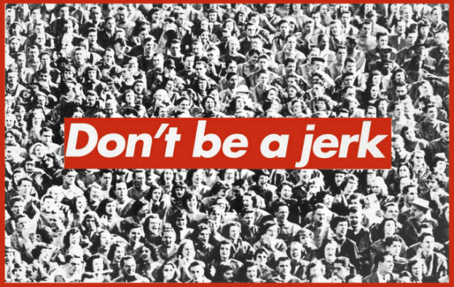
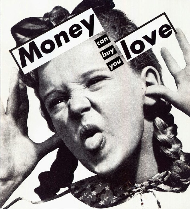
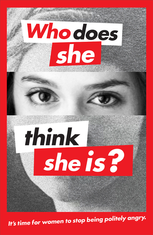
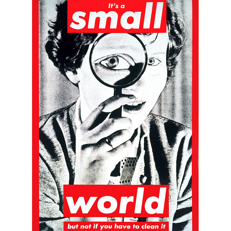
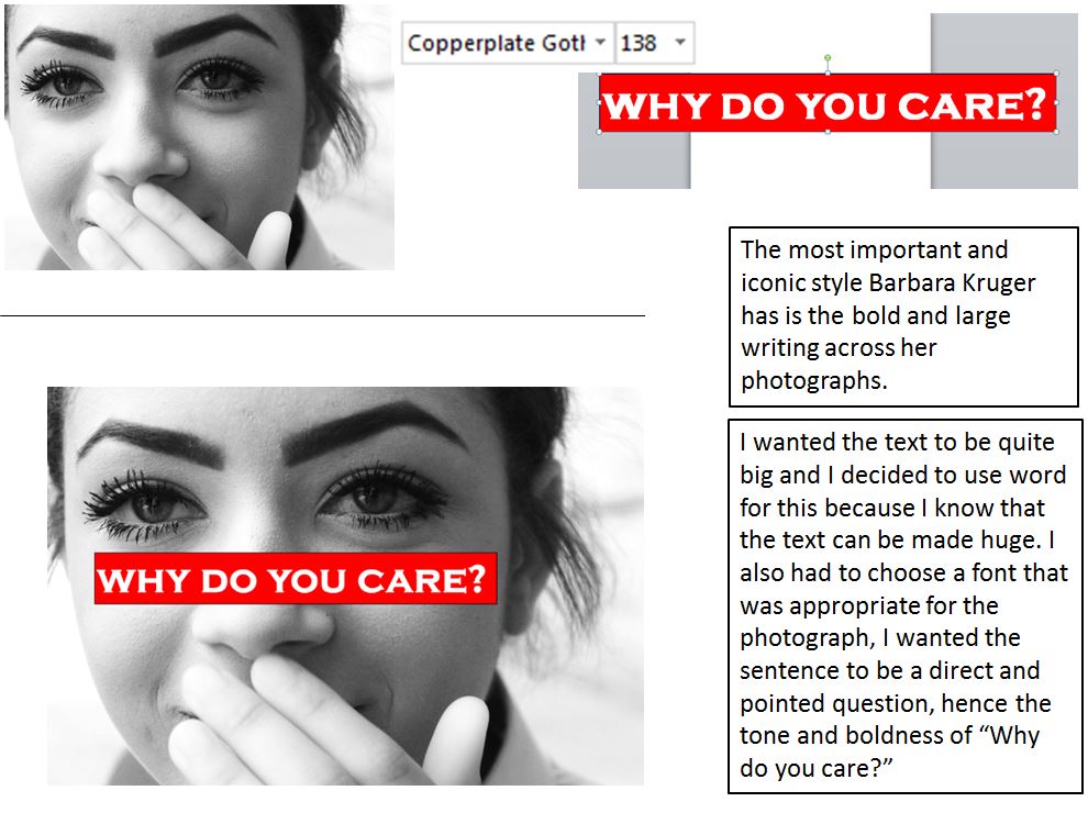
barbara kruger
|
Barbara Kruger is an American conceptual artist. Much of her work consists of black-and-white photographs overlaid with declarative captions—in white-on-red Futura Bold Oblique or Helvetica Ultra Condensed. The phrases in her works often include pronouns such as "you", "your", "I", "we", and "they", addressing cultural constructions of power, identity, and sexuality. Kruger lives and works in New York and Los Angeles.
I like this style of photography because it makes the observer think about what this artist meant and what she was thinking when creating a certain piece, for example the top left photograph that includes Marilyn Monroe with bold writing over her face saying "Not stupid enough" This implies that , society didn't expect a pretty girl to be smart, this comes from a stereotype that society has created over the years. |
      |
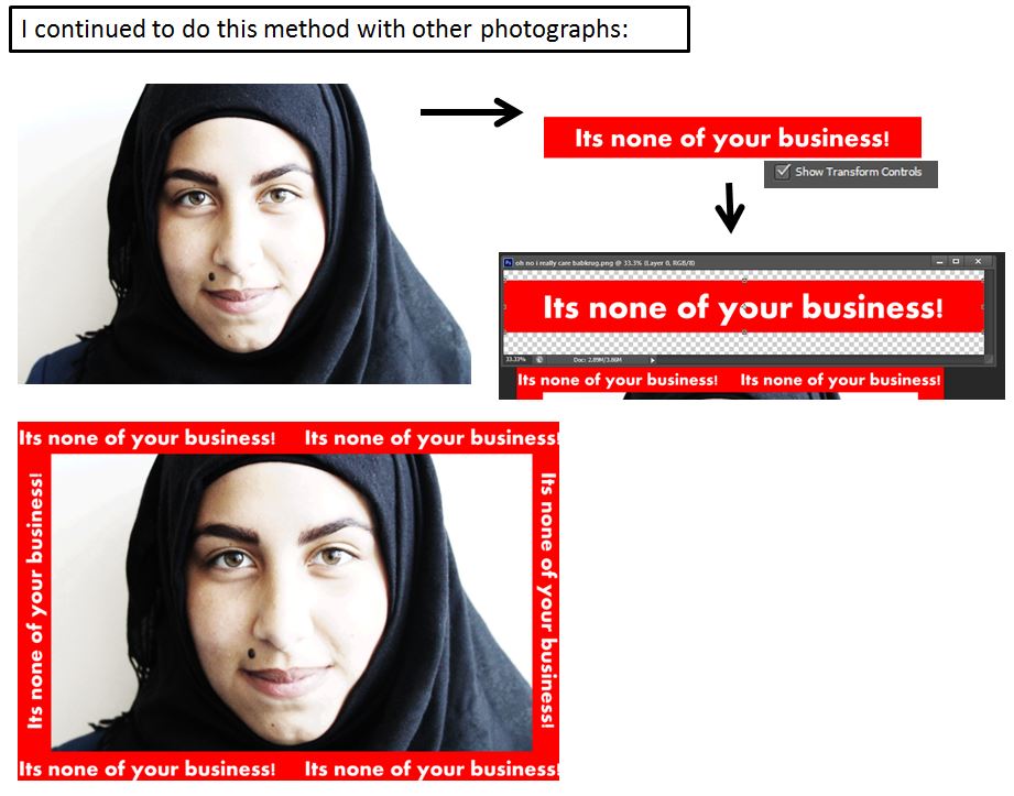
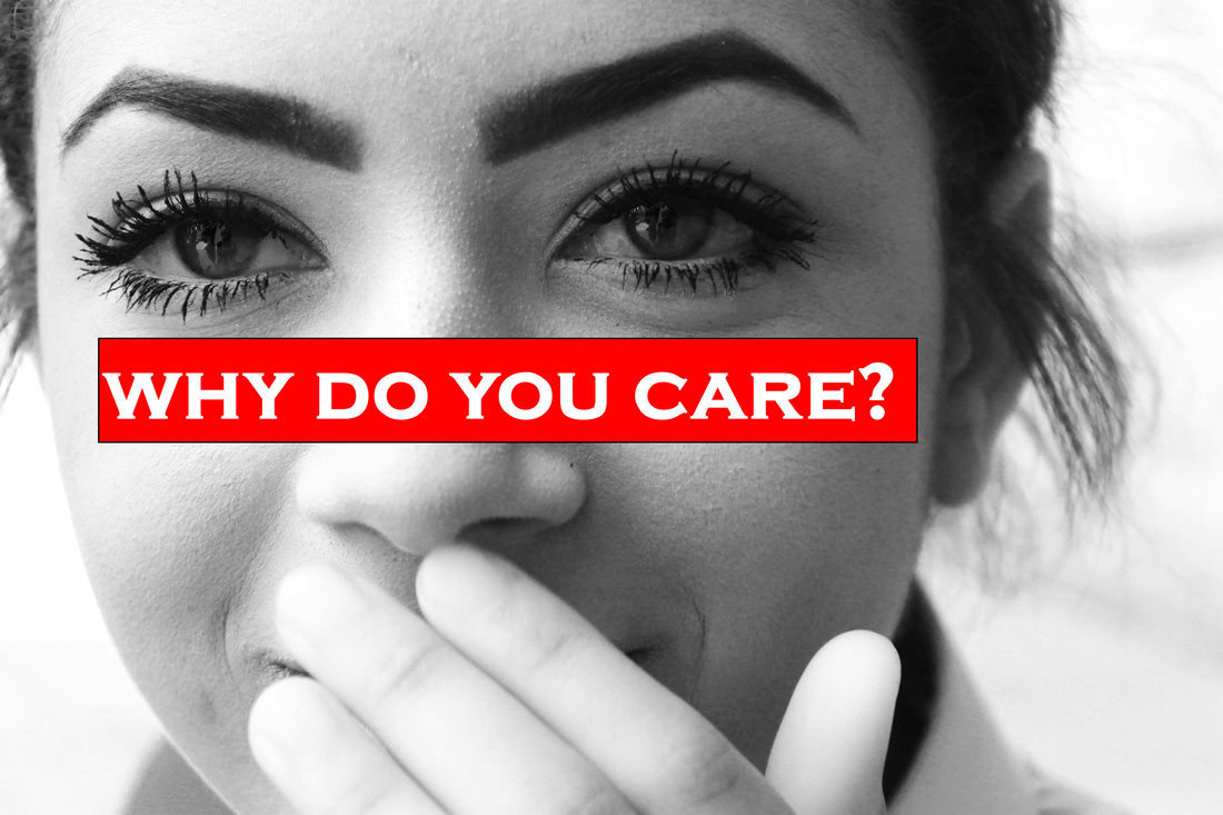
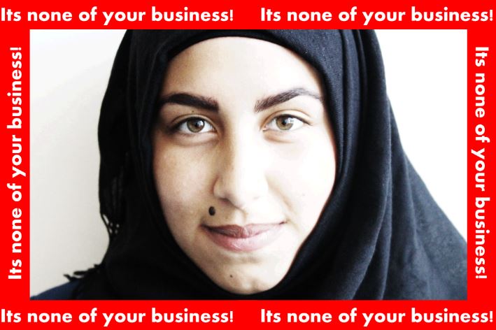
My response to Barbara Kruger:
Final images:
Developing ideas
final piece
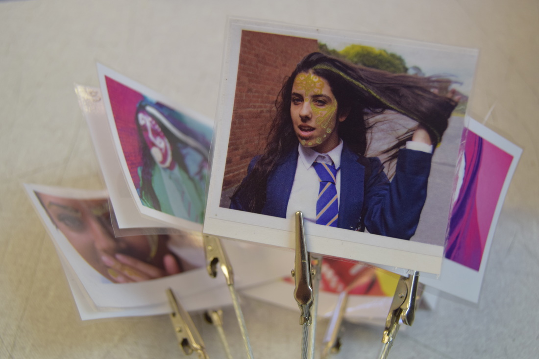
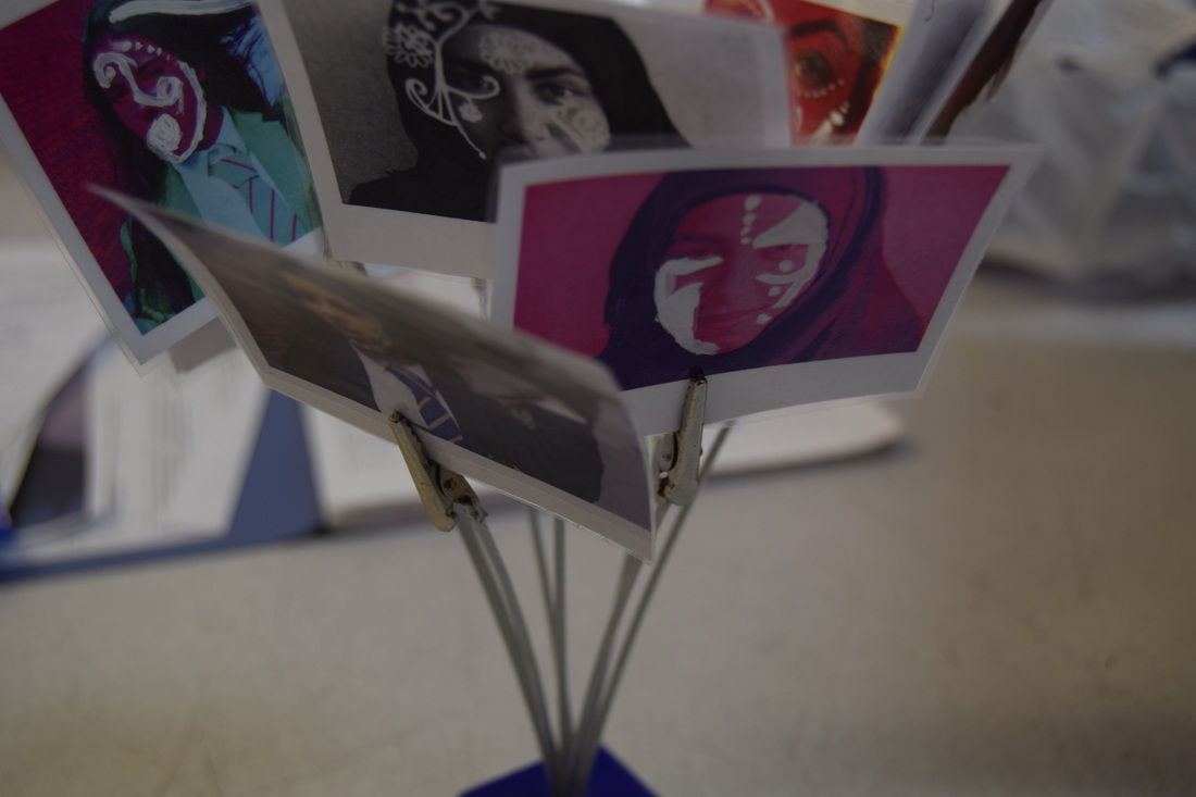
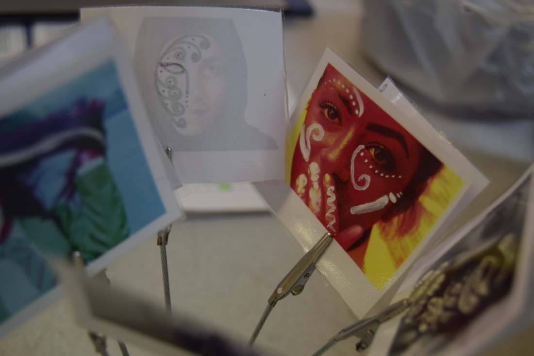
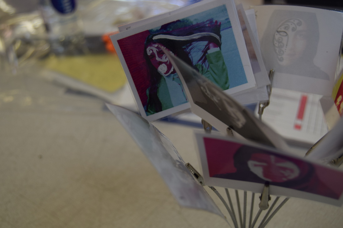
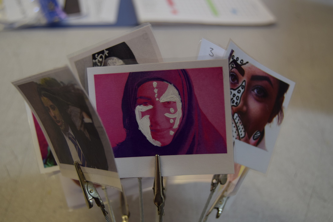
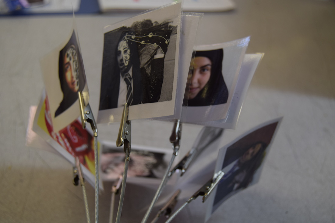
I wanted my final piece to look like polaroid photos, I was able to achieve this look by cutting theses photos down to size and laminating them, I also like the way they are presented on a holder.
Evaluation
This identity project was the most challenging for me. I do like the different aspect of it such as presenting emotions through facial expressions and body language, but this presented more challenges as u wasn't sure on most of the directions of the photos and I didn't have and intended atmosphere for some of the photographs. I knew that I wanted to explore the idea of distorting peoples identity and also changing and masking features using the inspiration from nina chakrabati, hence the use of editing over the top of photographs with gold pens, I liked using the media of pens on printed photographs, I was inspired by paisley patterns and some traditional henna. This worked incredibly well because the gold colour was bright and bold against the darker photographs. I liked experimenting with the bold block colours because they added more of a personality to my work.
I'm very pleased with my final piece because I wanted the photographs to look like polaroid's, I believe the way I made the photographs look was very effective in doing this, there a few mistakes with the cutting of the photos and how some aren't equal and do not have the bottom bar that normal polaroid's have.
I'm very pleased with my final piece because I wanted the photographs to look like polaroid's, I believe the way I made the photographs look was very effective in doing this, there a few mistakes with the cutting of the photos and how some aren't equal and do not have the bottom bar that normal polaroid's have.
